hallmark gives coding agents rules for web pages
hallmark is a frontend design skill for coding agents building web pages. Its themes set a starting style; choosing the right look still takes your judgement.
- Verdict
- Verdict: Try
- Tested
- Commit
4f6a46c- Source
- nutlope/hallmark
- Author
- Kahtaf Alam
Without design guidance, coding agents often build web pages you can tell are AI-made at a glance, and hallmark is a frontend design skill (instructions a coding agent loads on demand) meant to fix that. It gives the agent a theme to start from and rules against common AI-page patterns. Whether its pages look better is taste: we prefer its version of every page we show against plain Codex, OpenAI’s coding agent, while many users still find its look generic.
The README documents support for Claude Code, Codex, Cursor and OpenCode, with workflows for new pages, redesigns and audits.
Tested: commit
4f6a46c6dc325d40ab268c93e25c7b96676ebccdon November 1, 2026: 27 new pages from Codex: three briefs, each built three times in each of three setups: hallmark requested, installed but unmentioned, and absent. Users report: those who built with it say it removes the familiar AI-page tells, but many find the look generic or repetitive. Our result: none of the hallmark pages showed any of three patterns that its rules ban and that most plain Codex pages had: small spaced capital labels, small labels above headings and headings in several colours. We prefer its pages, as a matter of taste. On a redesign of an existing page, hallmark’s own check can miss a button that has stopped working, so test buttons and forms yourself. Verdict: try.
Set up hallmark with your coding agent
Paste this into a coding agent that can run commands. The skills installer needs Node 22.20.0 or newer, and the README lists Chrome and puppeteer-core for its browser checks; the npm package named hallmark is an unrelated Markdown linter.
Install the latest skill with `npx skills add nutlope/hallmark` for this project and this agent; read its instructions and check its help works. Stop if setup fails.
Ask before upgrading Node or adding browser dependencies [Chrome and puppeteer-core are needed for rendered checks]; I handle logins and secrets.
Use hallmark to build a small page from my brief and real material; ask before changing existing files and save their previous versions.
Show desktop and phone views, check the exact output files, independently test buttons and forms, and report changes and failures.
hallmark gives the agent a theme and page rules to start from
hallmark’s MIT-licensed themes supply palettes, type styles, backgrounds, and button and card styles. Its instructions ask the agent to identify the visitor’s job and arrange the page around it. Your brief still supplies the copy, images and brand constraints.
Users say hallmark removes AI-page patterns, and many find its look generic anyway
The reports below come from Reddit, X, Hacker News and the project’s GitHub issues, May to November 2026; version 2, which we tested, arrived in late October, and the Reddit threads below came after it. The loose counts (“many”, “a few”) are what people say, not what we measured.
A few who built pages with it praise the result. One Claude Code user’s same-brief test found the hallmark page “looked finished”, with no small capital labels, but it took about five times as long and, at API rates, cost about five times as much. Another, comparing five design skills, called hallmark’s run the cheapest and its page their favourite. Our builds took more steps with hallmark too: a median of 69 tool calls when requested and 79 when unmentioned, against 19 without it. Our test does not compare time or cost.
Many complain about the look: they say hallmark’s own example pages still “look like slop”. Most of them judged the README, not their own builds, and a few find the examples fine. A recurring worry, raised in a GitHub issue before version 2 and about design skills in general on Hacker News, is that builds converge on one look unless you are “extremely explicit”. The same-brief tester also got an old-English blackletter heading font for a coffee brand and had to ask for another theme.
We prefer the hallmark pages, as a matter of taste
We supplied three briefs: an invoice-reminder page whose form drafts a payment reminder, a transcription pricing page and a furniture maker’s portfolio. Codex built each brief in three setups (hallmark requested, hallmark installed but unmentioned, no hallmark), three times per setup.
Codex used hallmark in every build where it was installed but unmentioned, with hallmark the only skill installed; if your agent overlooks it, the README suggests naming it: “use hallmark to build …”. We show the first build from the plain and hallmark-requested setups, chosen in advance; plain Codex comes first in each pair, then hallmark requested. You may prefer the plain pages, so the screenshots are here to judge. The businesses and people are fictional.
hallmark’s reminder page uses larger form text and one panel
On desktop, hallmark’s larger form text, single white panel and on-screen copy button read more easily than plain Codex’s nested boxes and tiny labels. On a phone, plain Codex’s orange button stands out more, but we still prefer hallmark’s page.
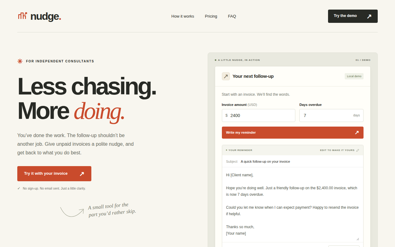
Nudge invoice-reminder brief on desktop, Codex without hallmark.
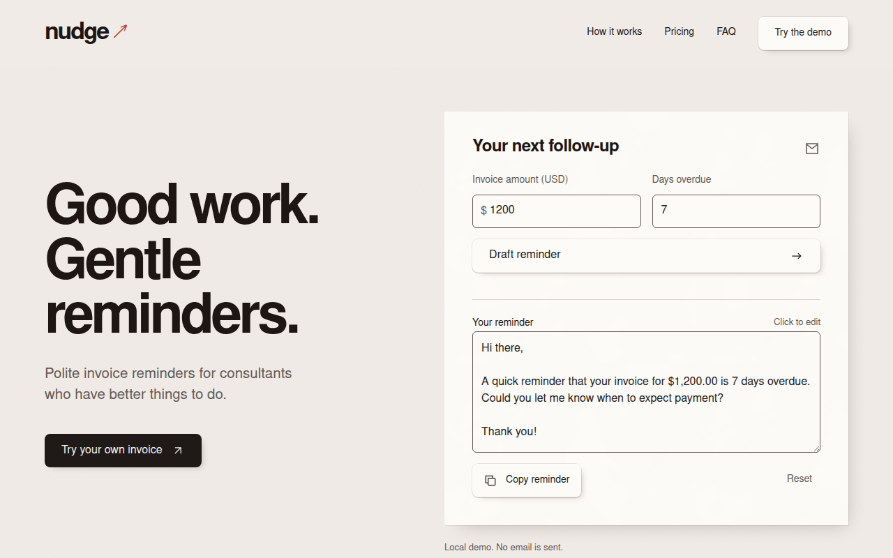
On desktop, with hallmark.
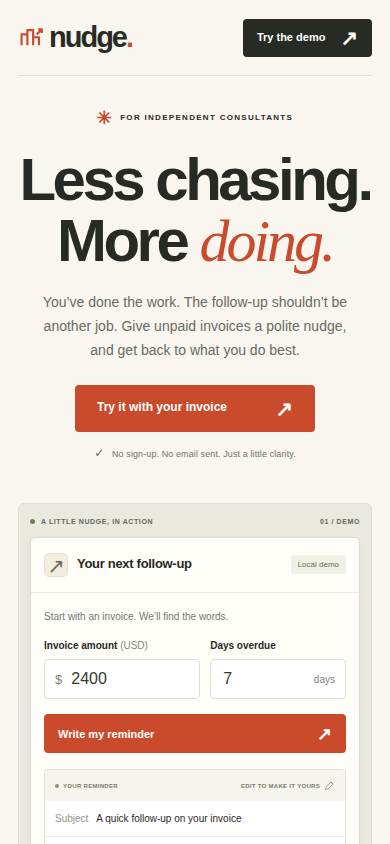
On phone, without hallmark.
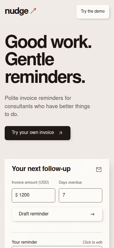
On phone, with hallmark.
hallmark’s pricing page lines the plans up for comparison
On desktop, thin dividers align hallmark’s plans into an easy comparison, with each plan’s allowance under its price. On a phone, hallmark runs the plans as one long open column, while plain Codex’s card shows its choose-plan button sooner; we still prefer hallmark’s look.
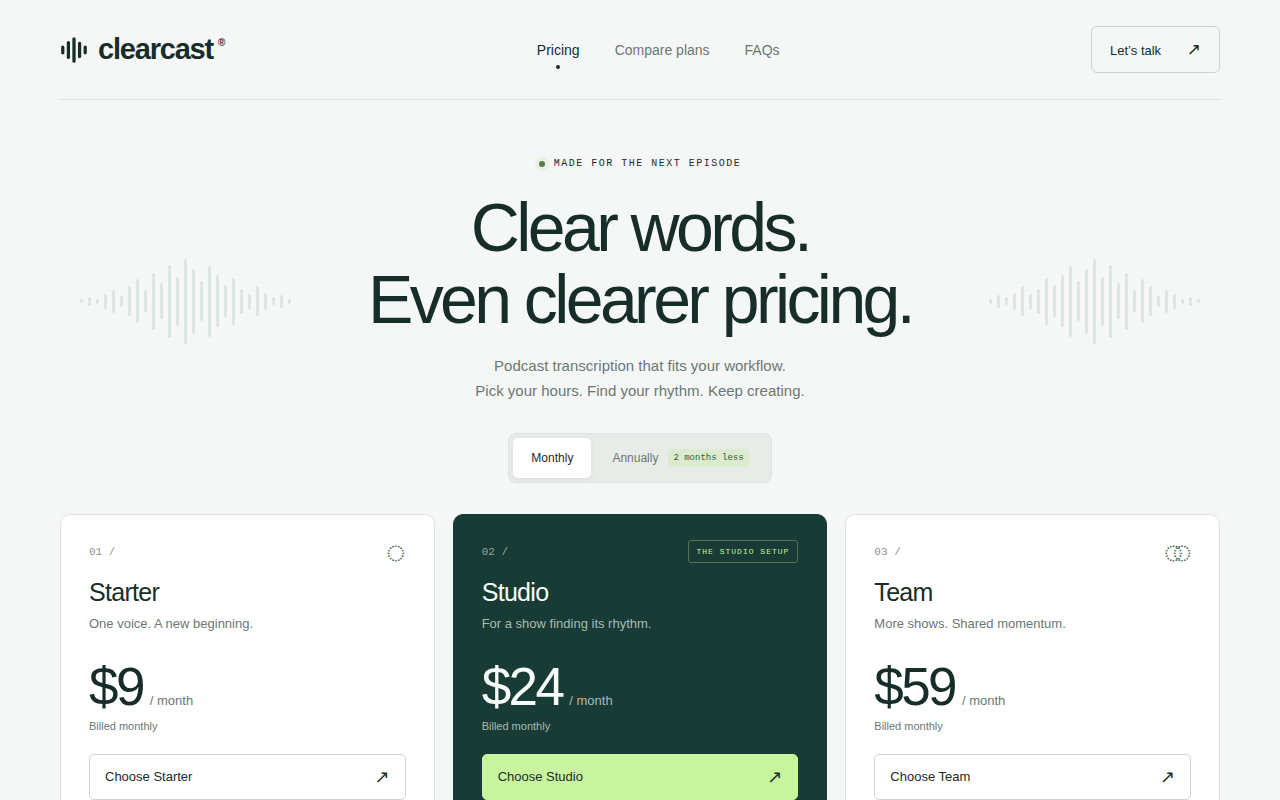
Clearcast transcription-pricing brief on desktop, Codex without hallmark.
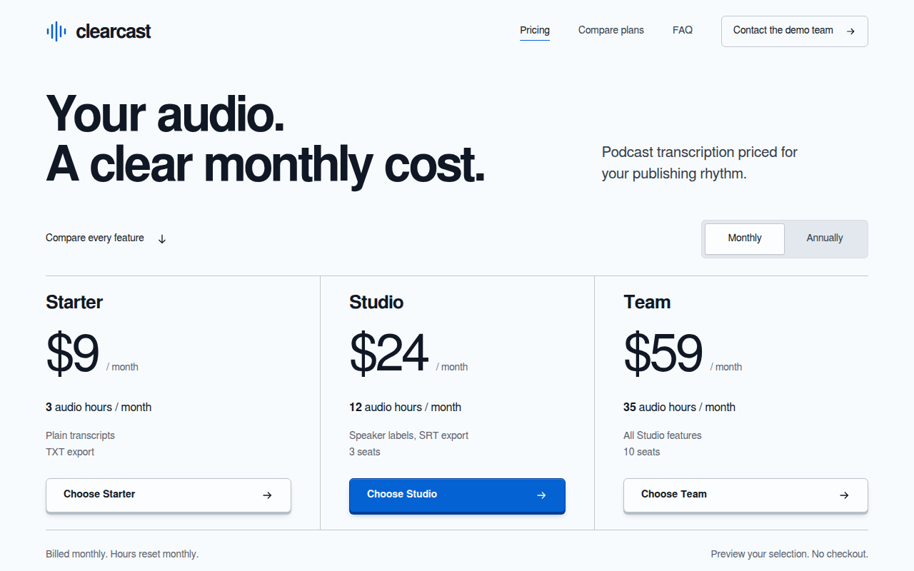
On desktop, with hallmark.
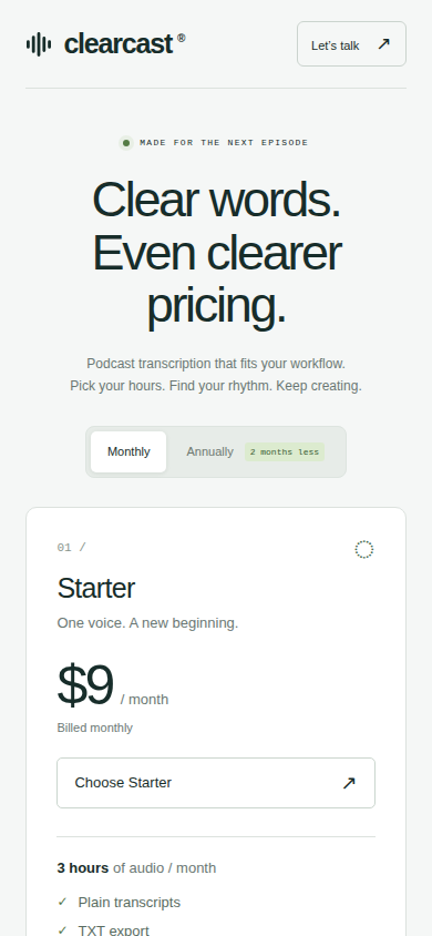
On phone, without hallmark.
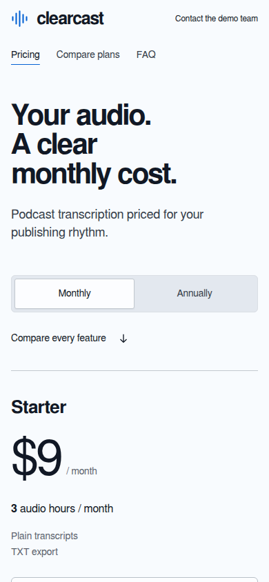
On phone, with hallmark.
hallmark’s portfolio gives the photograph more room on a phone
Both portfolios use a supplied hand-plane photograph standing in for the fictional maker’s work. On desktop, plain Codex’s burgundy type suits the warm photograph, and hallmark’s blue button stands apart from it. On a phone, hallmark’s shorter heading and side-by-side links give the photograph more room. We prefer hallmark’s page on both.
Reference photo by Terasaface, Creative Commons Attribution-ShareAlike 4.0, cropped in the page layouts and toned in hallmark’s.

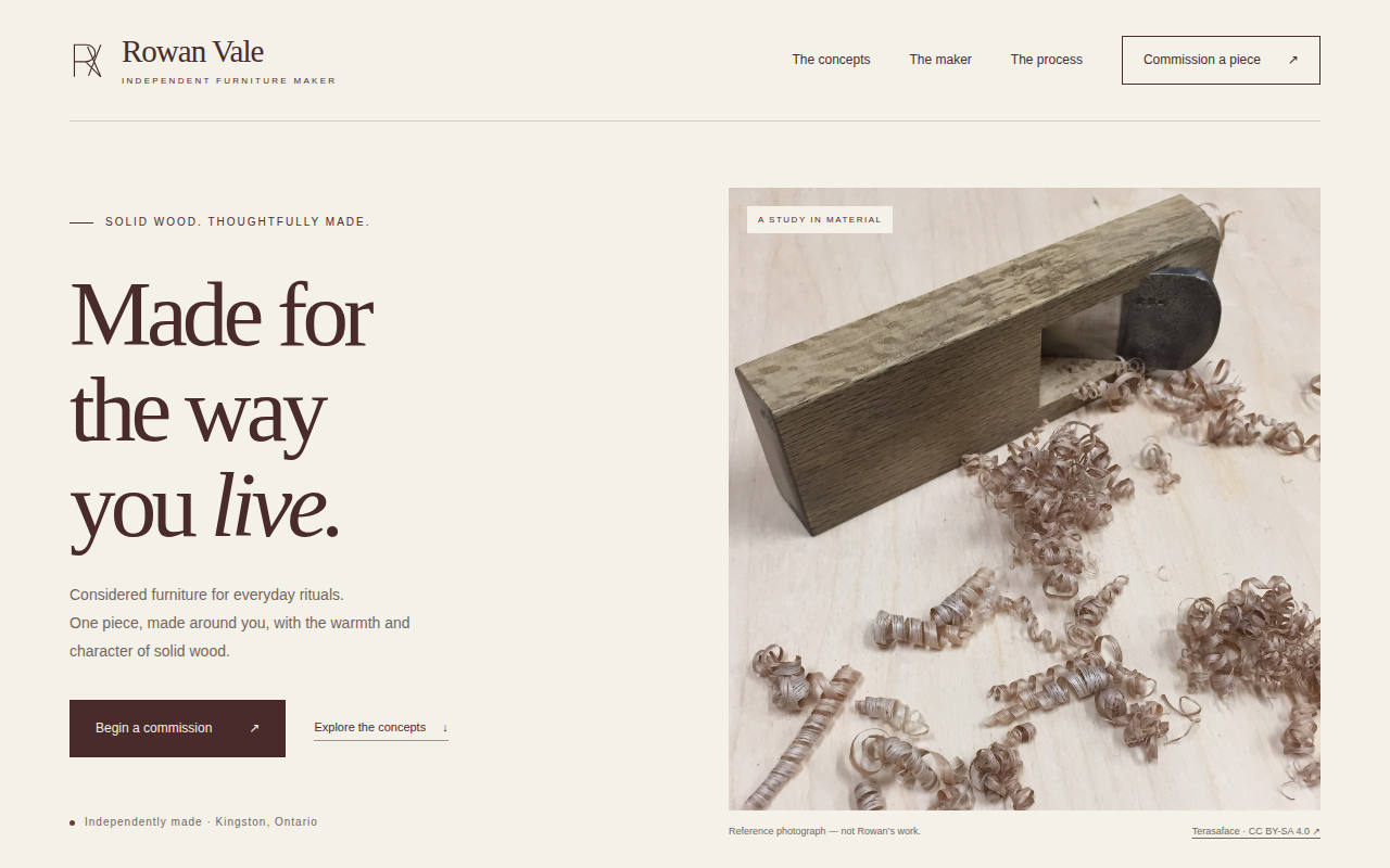
Rowan Vale portfolio brief on desktop, Codex without hallmark.
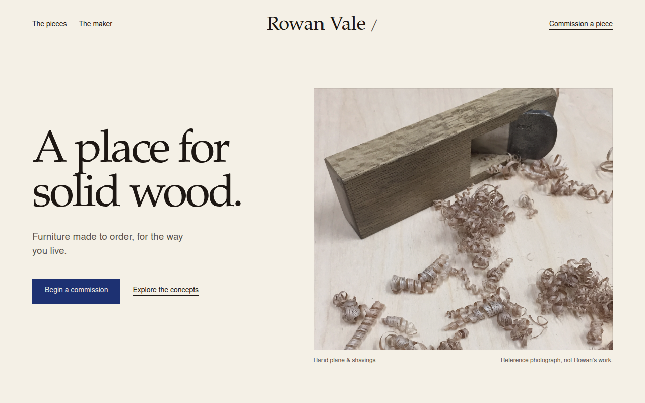
On desktop, with hallmark.
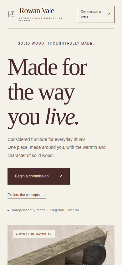
On phone, without hallmark.
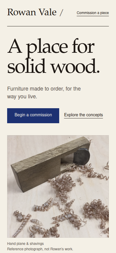
On phone, with hallmark.
hallmark’s pages drop small labels and coloured headings but repeat their look
Each cell is the number of desktop pages containing that pattern, out of nine per setup. “Small spaced capitals” means capital text with a font size of at most 20 pixels, with at least one pixel of extra space between letters.
| Pattern on a page | Without hallmark | hallmark requested | hallmark unmentioned |
|---|---|---|---|
| Small spaced capitals | 9 | 0 | 0 |
| Small labels directly before headings | 9 | 0 | 0 |
| Headings using several text colours | 6 | 0 | 0 |
Phone views give the same counts. These counts show that hallmark follows its own rules, which matches what users report. They do not show better-looking pages, and labels and coloured words can serve a purpose.
The repetition users worry about showed up too. Across repeated builds of one brief, hallmark’s pages mostly kept their fonts and colours, and in the reminder and portfolio briefs their first-screen layout too; its portfolios kept blue buttons. Plain Codex repeated its own look within each brief as well. Our briefs set a tone but didn’t name a theme. For a distinct brand, try supplying references, naming one of hallmark’s themes, or using hallmark’s documented “custom” mode, which designs from your prompt without a theme; our test does not cover those.
hallmark’s redesign check can miss a button that has stopped working
For redesigns, hallmark’s preservation check, part of its sloplint.mjs script, compares the changed page with a saved original. The README says it fails a redesign when a link, form field, click handler or heading goes missing. We removed content and behaviour deliberately to check; our test does not cover a full redesign.
| Deliberately removed item | What the check reported |
|---|---|
Link, form field, or click action written on the button itself (onclick) |
Flagged as a failure |
| Heading | Warning |
Click action attached from a <script> block (addEventListener) |
Not flagged |
The button stayed visible after its working code was removed. Cases with nothing removed produced no false preservation failures.
Save the original page. Before editing, run sloplint.mjs --before to record the page’s content and actions; afterwards, use --kept on the same files to compare. Read its warnings as well as its failures, since a removed heading only warns. Point the checker at the build folder alone: when one command listed its parent folder first and dist second, it skipped dist; build and coverage behaved the same. Then run independent browser interaction tests for important clicks, form validation and output.
Try hallmark for prototypes, and judge the look yourself
Try hallmark if you build new web page prototypes and want a ready-made palette and type style without the familiar AI-page tells. Whether it suits you is taste, so build one real brief, expect it to take longer, and compare the pages with your usual output.
For a distinct brand, try supplying references or naming a theme. After a redesign, test buttons and forms yourself, because hallmark’s own check can miss one that has stopped working; also read the check’s warnings and point it at the build folder alone. Skip it if your own design rules already give you the look you need. We have also used it outside this test, on a quick site we had built with a coding agent, where it made the site look much better and removed most of the AI tells.